YEAR / 2021
BRIEF
This exhibition branding project will ask you to explore the subject of the brand in a broad manner. You will be expected to form a strong conceptual understanding of a politically / culturally / socially significant subject matter and to develop graphic language appropriate to your chosen theme. You must create a unique name for your exhibition identity and you will develop your brand through the design and implementation of a graphic system. This will form the basis for your design choices across a number of deliverables.
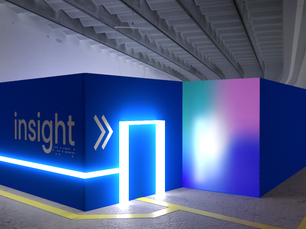
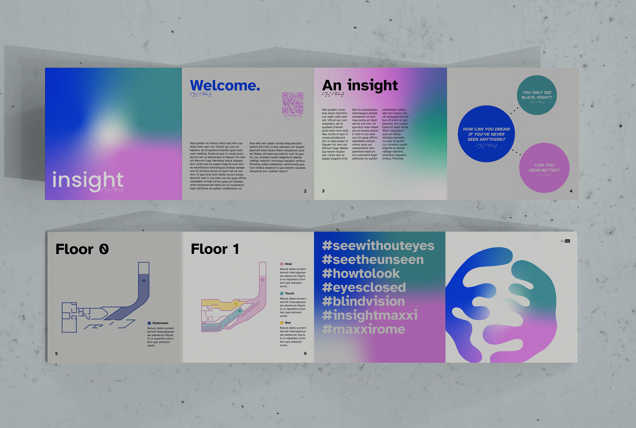
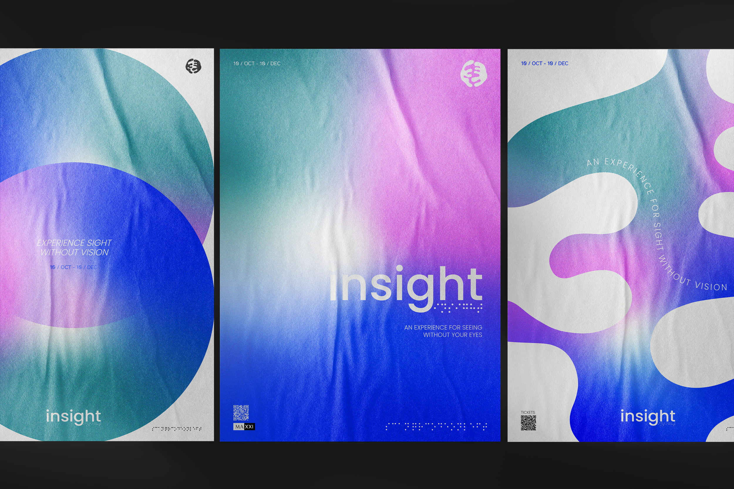
Insight.
RESPONSE
I wanted to pursue a social context unfamiliar to me: visual impairment and blindness. Social media often makes it difficult to distinguish between what is genuine sharing of knowledge, and what follows the apparent ‘trend’ of openly discussing disabilities such as blindness. This creates common misconceptions, including that blind individuals see nothing. This inspired conceptualising and branding of the hypothetical exhibition Insight. The vibrant colour scheme, whilst applying it with a grain, gradient, and sporadic bursts of white reflect impaired seeing. The typeface Atkinson Hyperlegible maximises visual accessibility, whilst integrating QR codes and braille offers alternative ways to access information. The brand aims to provide a truthful reflection of visual impairment, whilst being both accessible to those affected, and challenge the normally-sighted.